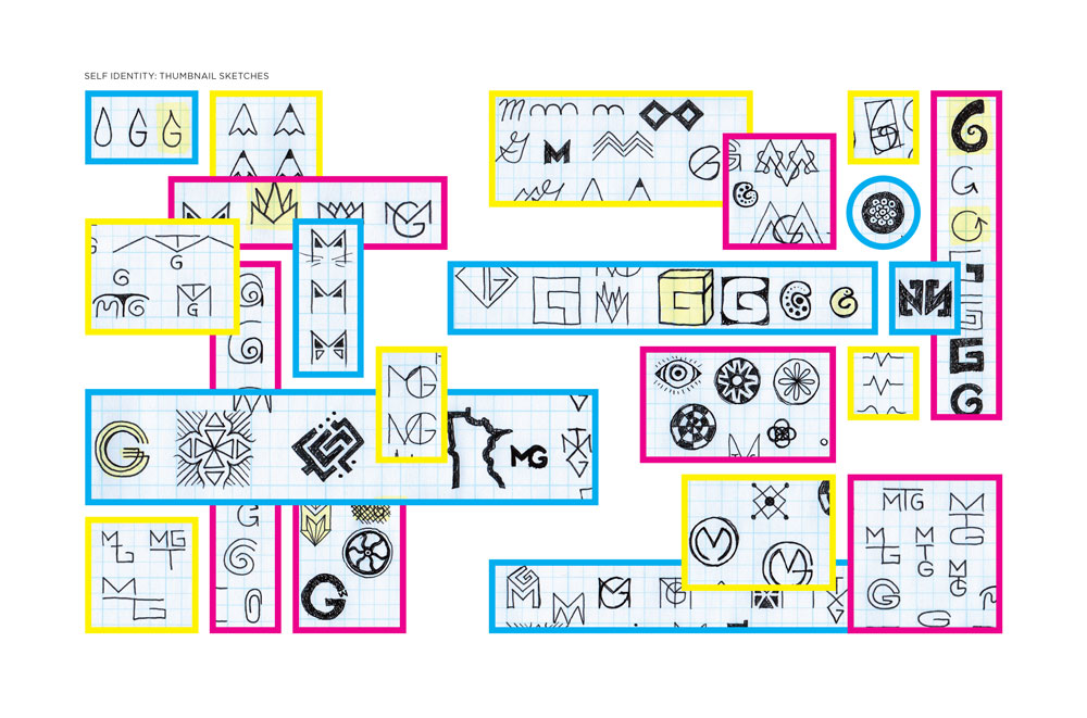
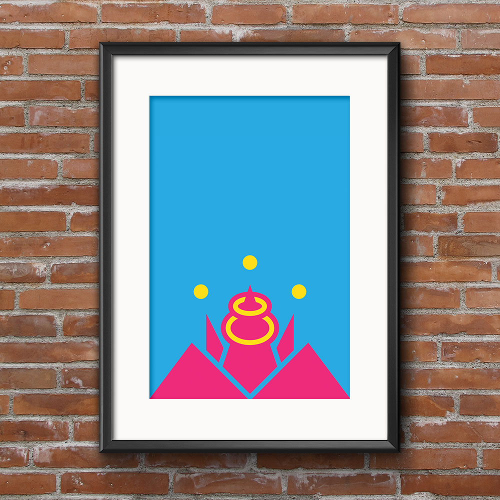
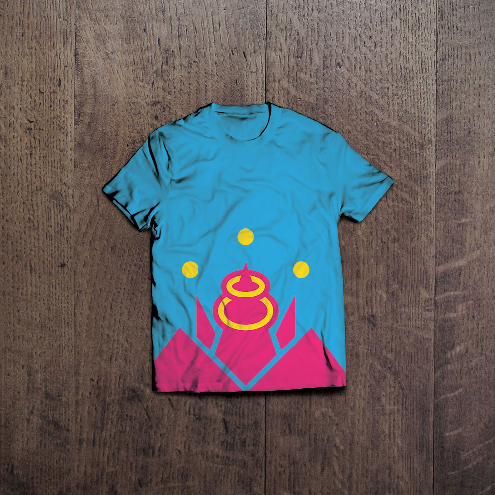
The first challenge that I faced when designing my personal mark involved avoiding the cliché of sticking my first and last initials together and calling it a day. Admittedly, the base of the mark is in the shape of a capital letter ‘M’. The rest of the design was born from this foundation.
My marks purpose is to exemplify my own design sensibilities, and to distill my style down to its simplest form. Therefore, I gave my logo characteristics that can be seen throughout all of my other work. Such characteristics include:
- SYMMETRY, which provides balance, as well as a certain elegance;
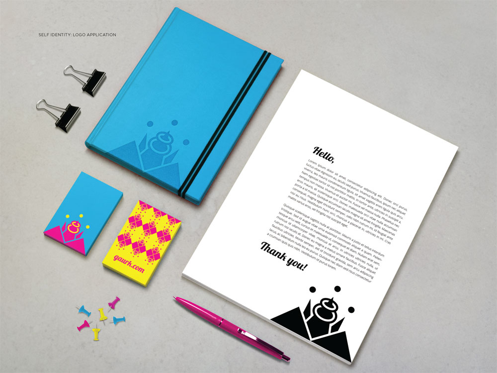
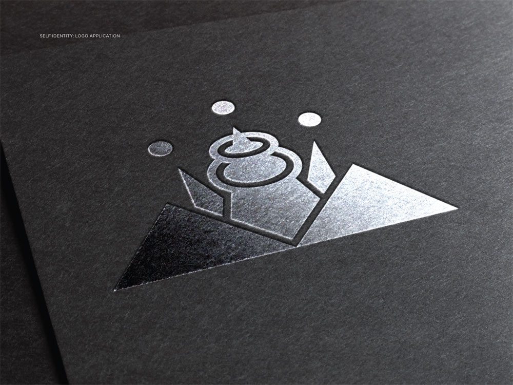
- SIMPLICITY, for less is more. Such a design needs to be able to work at a variety of sizes, and it also needs to look excellent in black and white;
- COLOR, for my designs tend to employ as many bright, bold colors as possible, (where applicable, of course). It is in this way that my designs can achieve the most contrast, and therefore visibility. My mark utilizes cyan, magenta, and yellow, the three colors from whence all other colors are created.