Bienvenido a México: Concept
The challenge here is that I needed to create a mark that represented the whole country, as if I were the graphic designer who was hired by Mexico’s tourism board. The mark needed to be friendly and inviting.
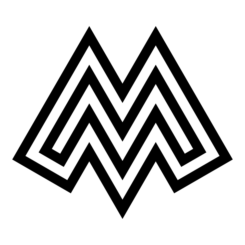
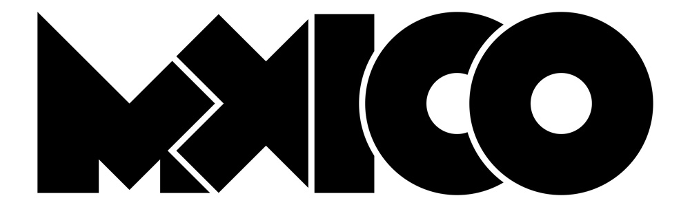
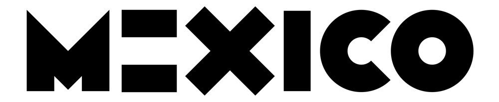
After researching the country, I played around with various letterforms until I created a capital letter ‘M’ that was designed to mimic the ancient architecture of the Mayan pyramids. The bright colors of the design mimic the bright colors of Mexican folk art. The topmost color is blue (sky), while the foundation of the mark is green (grass/earth).
Thumbnail Sketches
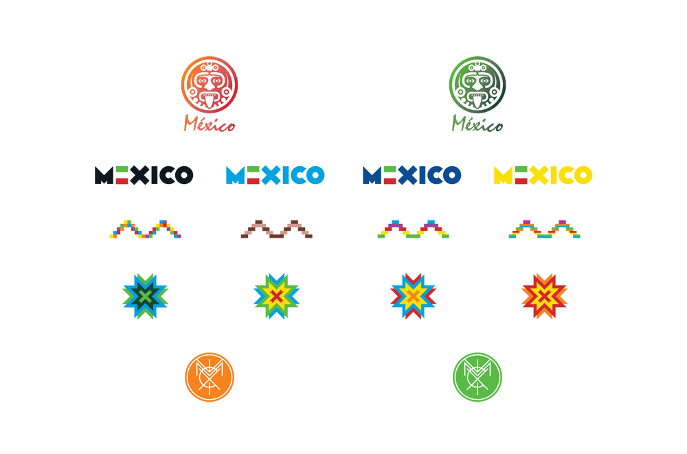
Logo Design Process (Color)
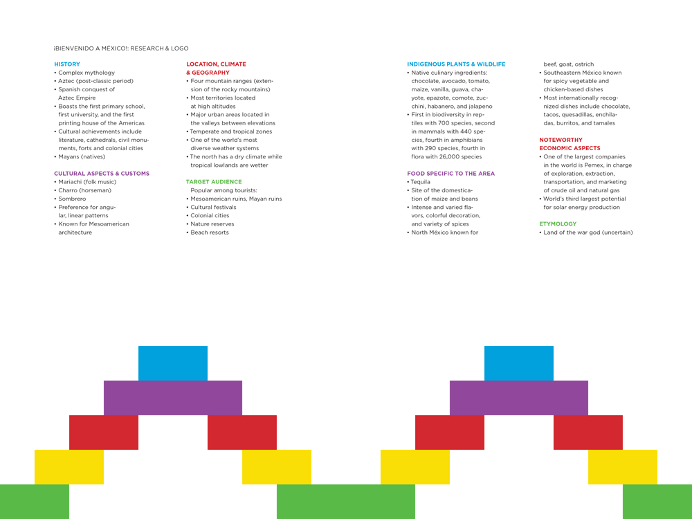
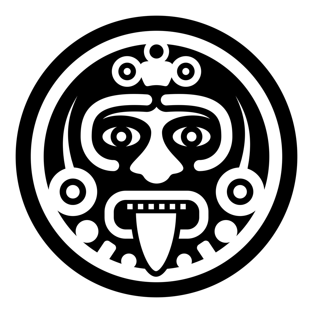
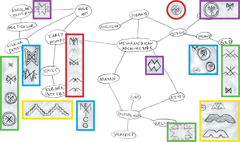
Research
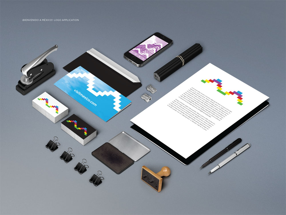
Stationery
Travel Poster
Travel Poster
Travel Poster
Travel Poster