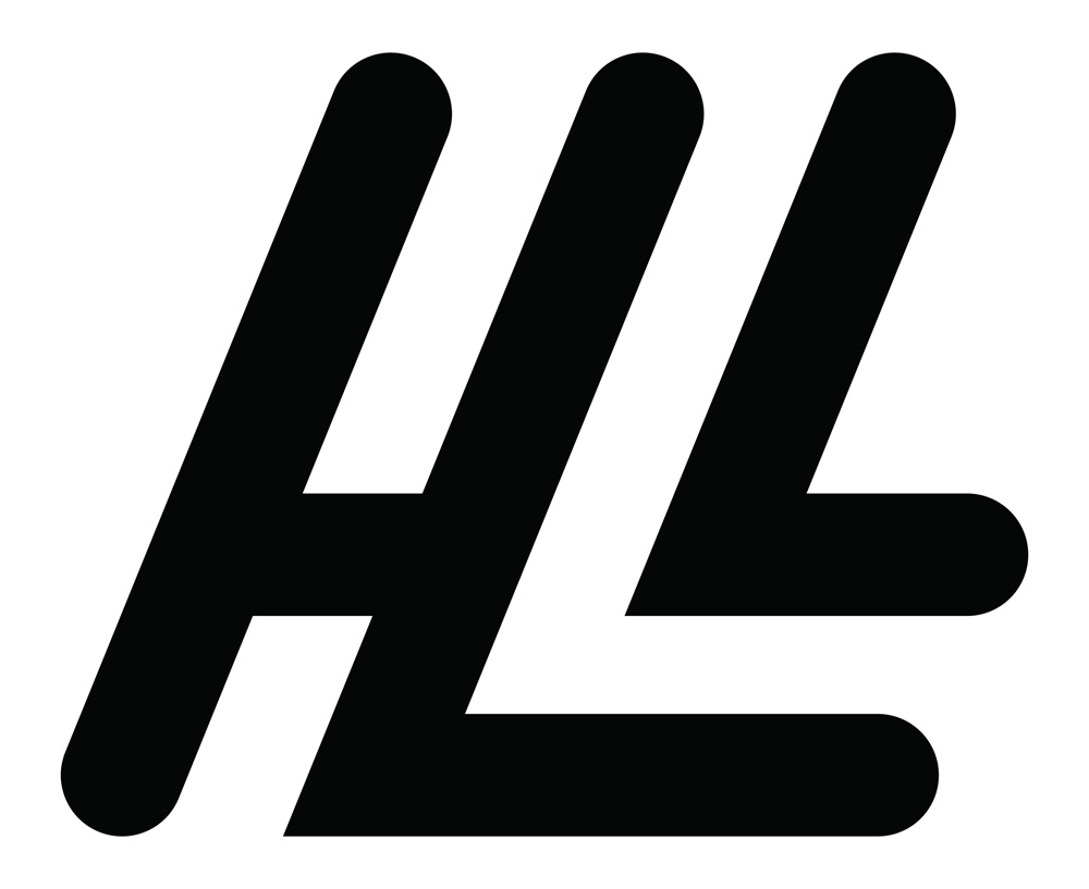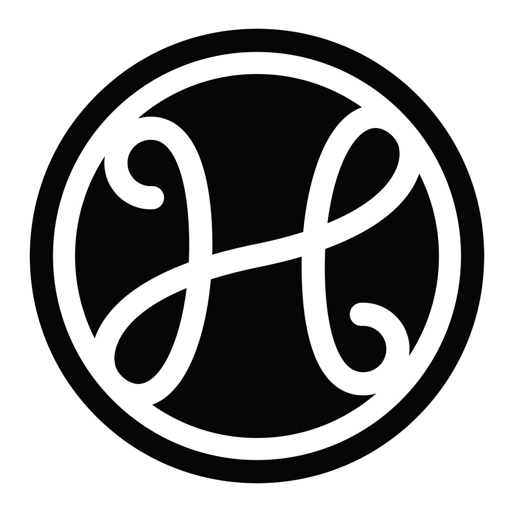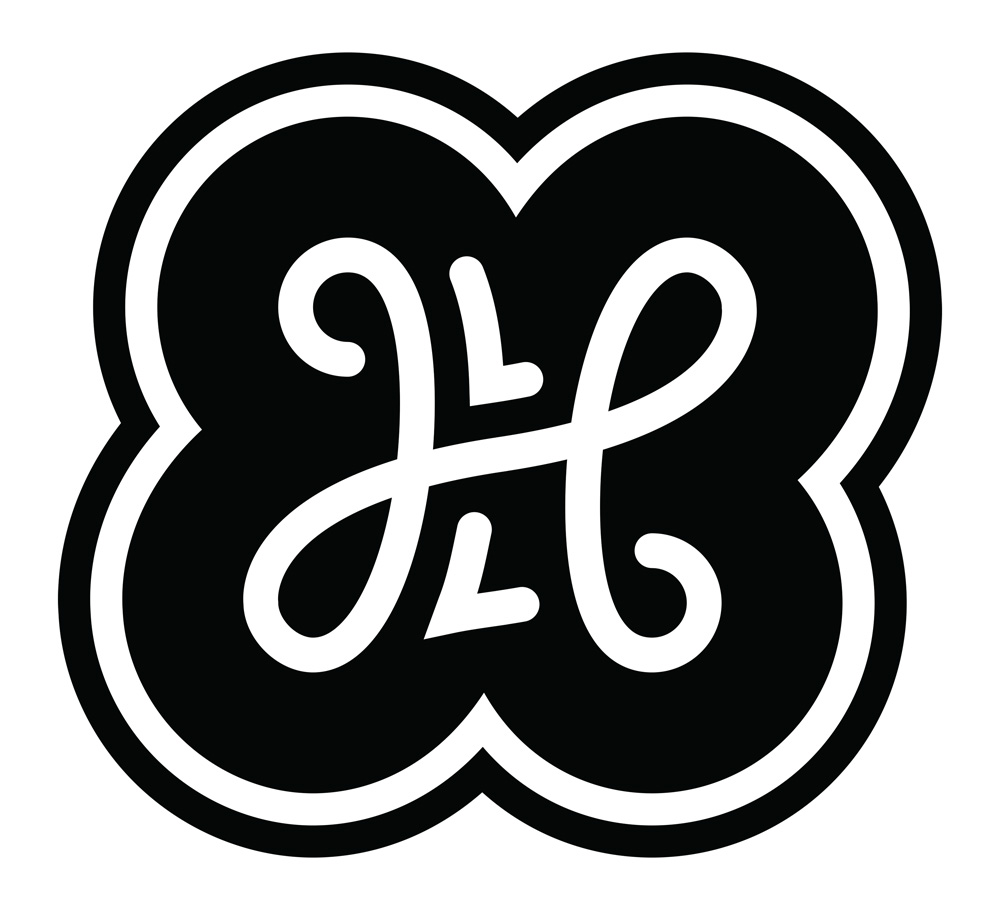
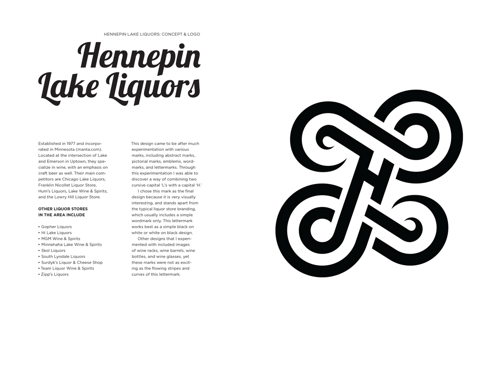
Hennepin Lake Liquors: Concept
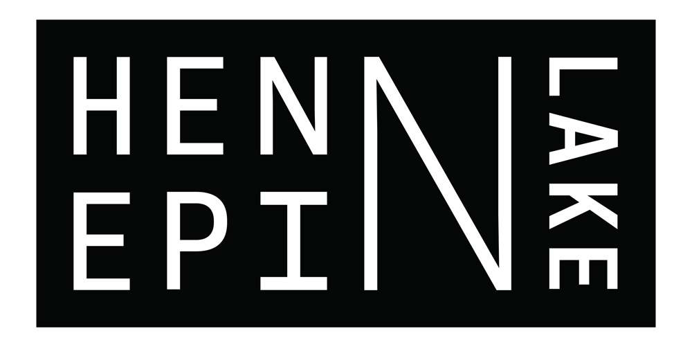
This design came to be after much experimentation with various marks, including abstract marks, pictorial marks, emblems, wordmarks, and lettermarks. Through this experimentation I was able to discover a way of combining two cursive capital ‘L’s with a capital ‘H.’
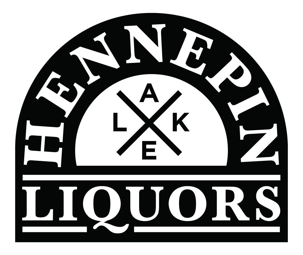
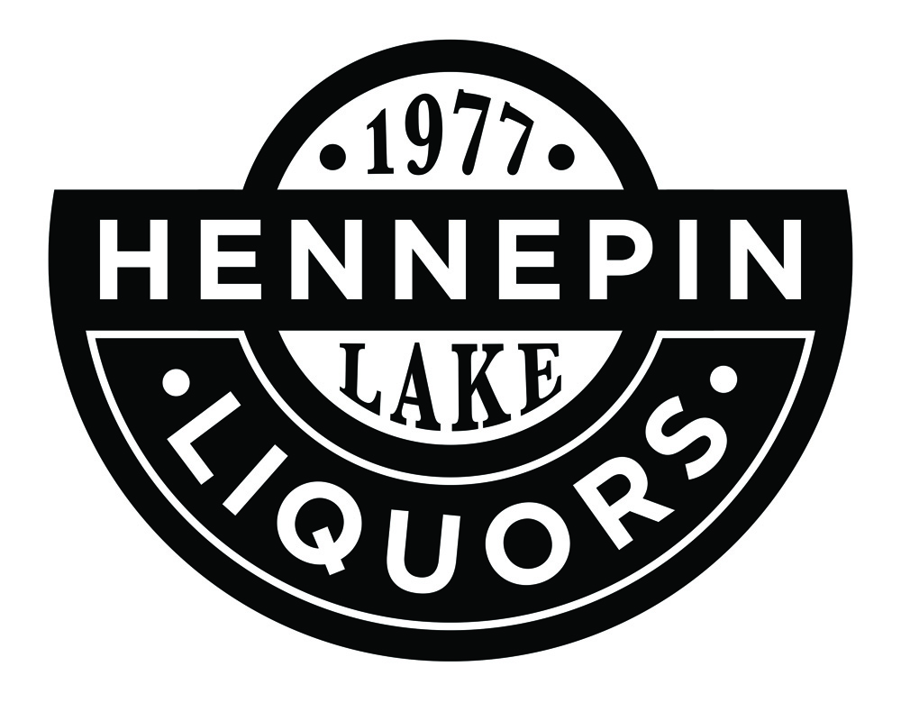
I chose this mark as the final design because it is very visually interesting, and stands apart from typical liquor store branding, which usually includes a simple wordmark only. This lettermark works best as a simple black on white or white on black design.
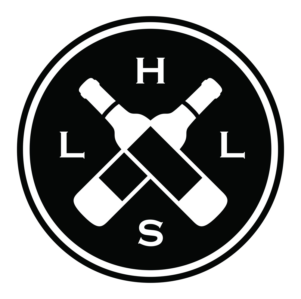
Other designs that I experimented with included images of wine racks, wine barrels, wine bottles, and wine glasses, yet these marks were not as exciting as the flowing stripes and curves of the lettermark.
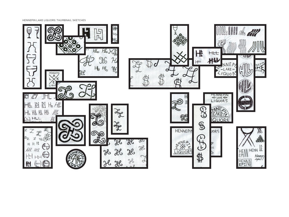
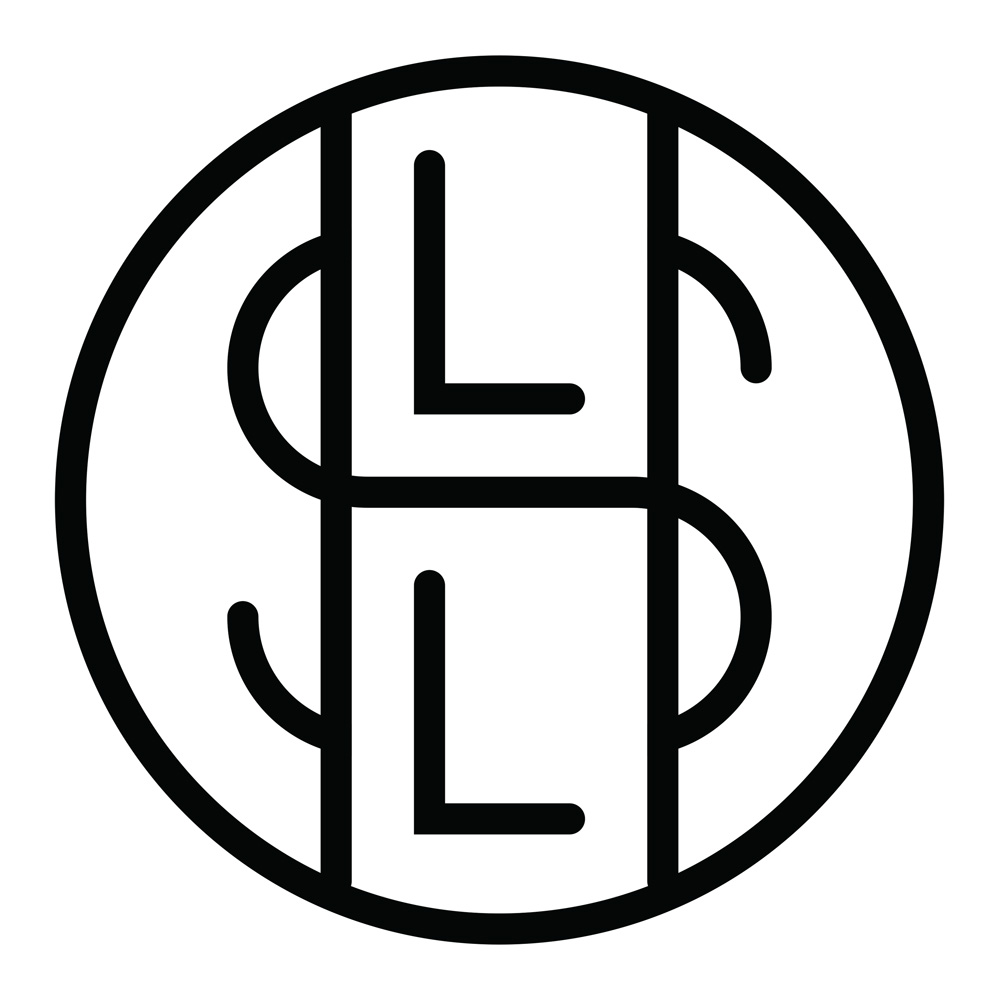
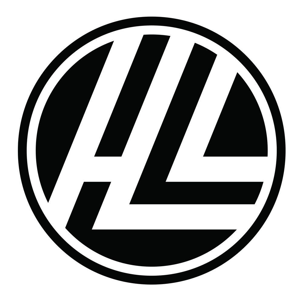
Thumbnail Sketches
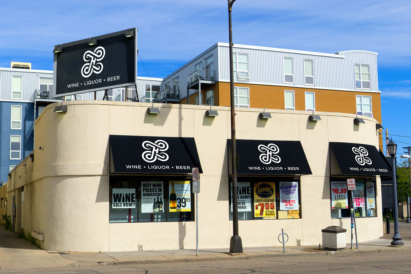
Finished Lettermark
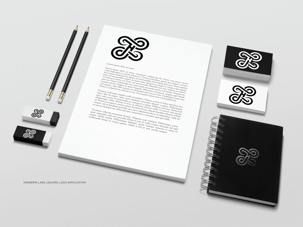
Stationery
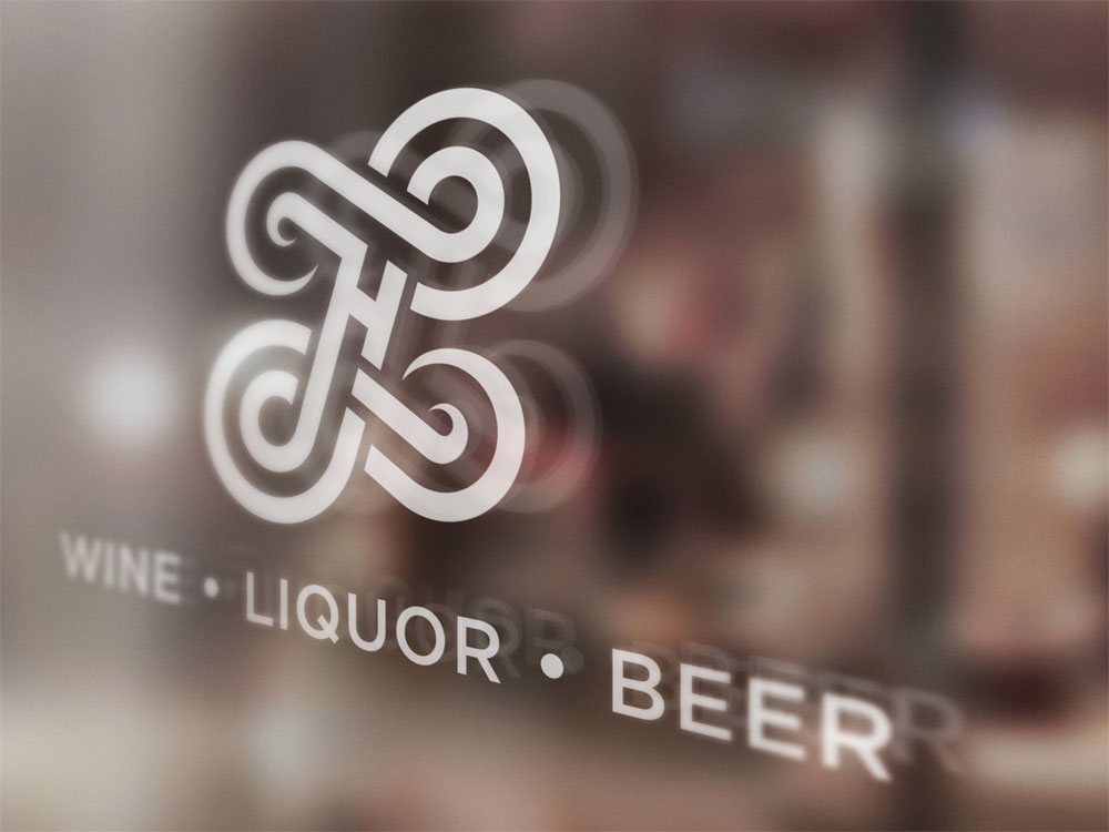
Window Decal
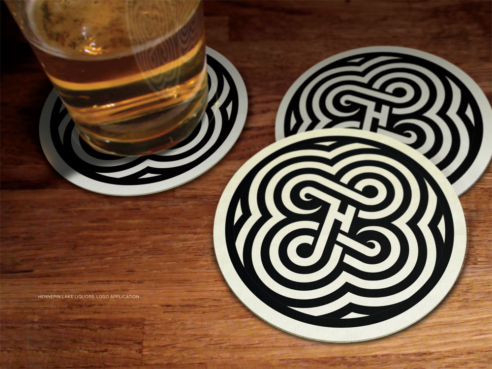
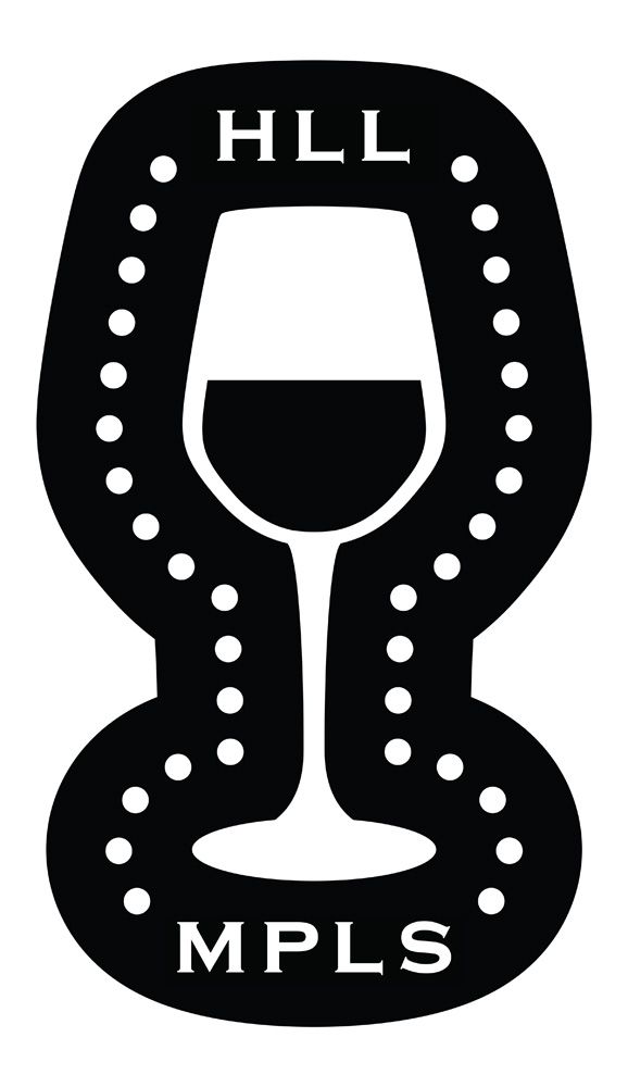
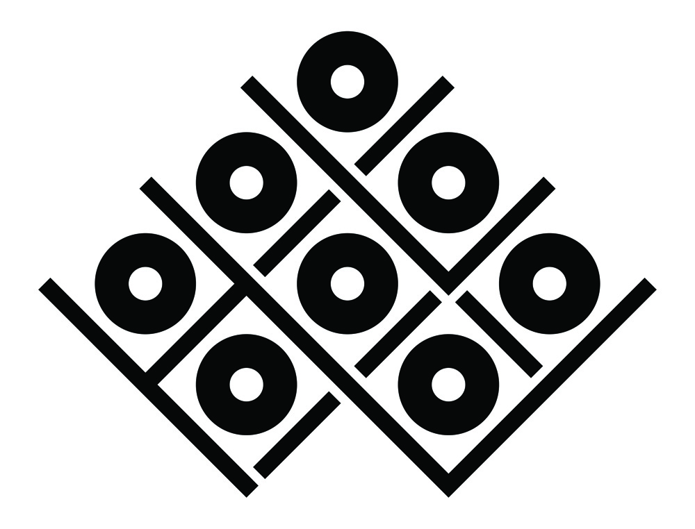
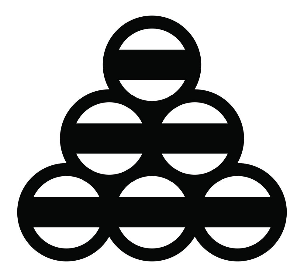
Coasters